Client: Curiosity Tank
Roles in the project: Branding, web design, graphic design for marketing
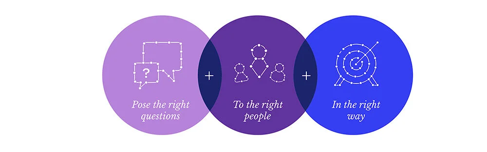
Michele Ronsen approached me with a request to finish a previously started branding work for her new business Curiosity Tank, which teach UX and UXR processes to aspiring UX designers and researchers. She had some initial design exploration done for the brand, but nothing felt appropriate. From the initial work, we chose the metaphor (magnifying glass) that resonated with the mission of the business, and I continued exploration until a finalized design.
Curiosity Tank also needed visual identity (colors, fonts, illustration styles, patters, etc.), website, graphics for online courses and workshops and related certification, and marketing assets like presentation templates and social media & email graphics. All this was created with the new visual identity as the guidelines.
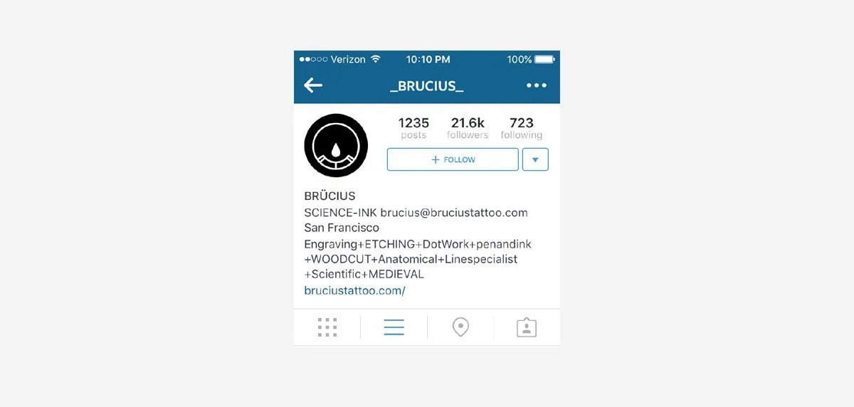
Client: Black Serum Tattoo
Role: Logo design
Three logo concepts for Black Serum Tattoo studio in San Francisco.
REIMAGINING THE GIRL SCOUTS OF AMERICA
Project: Conceptual
School: Academy of Art University
Roles in the project: Design, printing and binding
Client: No Fuss Meal Prep
Role: Brand design and supporting with brand strategy
No Fuss Meal Prep provides meal preparation guidance for healthy home cooking for busy adults working in tech (nerds by their own description).
Alexandra Moravek, the founder of No Fuss Meal Prep, worked closely with me to ensure the branding will reflect her business accurately and authentically.
Alex already had a website up, and needed just a little help with applying the new identity to the existing site. I helped her understand what color in her library would be just right for the primary button on her website. And what color would work perfectly for the Call to Action buttons.
We also looked at her brand fonts. And I made sure she has appropriate sizing and font weight for different text styles (header vs. body copy, etc.)
During the process, I helped Alex to figure out what kind of photography might appeal to her audience. And she is still working to test different styles with her audience.
To help her find the right photography style (and get a feeling about the visual direction), Alex has used mood boarding exercises that I gave her. I taught Alex to find images and use them as a way to communicate what she would like her brand to look like.
Alex then tested these mood boards with her ideal customers and picked the photos that resonated the most. We also used one of the photos her audience really liked as the starting point for the color library. See below.
Agency: Salt Branding
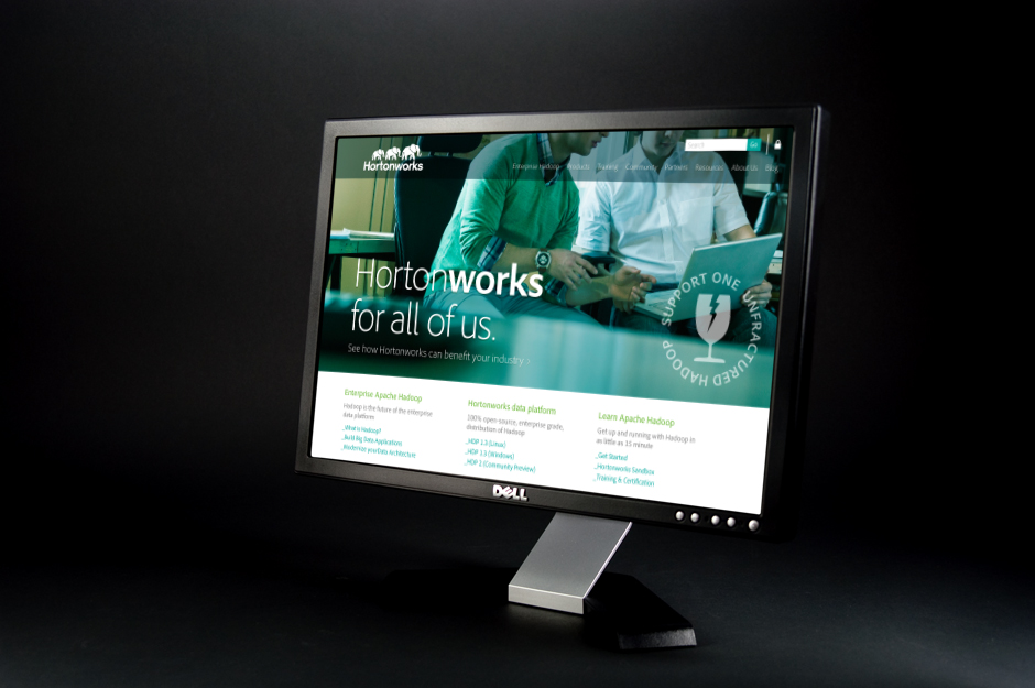
Client: Hortonworks
Roles in the project: Design (branding), Concepts, (scroll down for some icon & illustration concepts)
Hortonworks is a business computer software company that focuses on the development and support of Apache Hadoop, a framework that allows for the distributed processing of large data sets across clusters of computers.
I created three different identity concepts for Hortonworks. Beyond the concepts, I built suggestions for icon styles after the design direction and concept was selected.
Agency: Salt Branding
Client: Ericsson Mediaroom
Role in the project: Campaign design
Ericsson Mediaroom is an end-to-end video platform for operators to deliver Internet Protocol television IPTV subscription services, including content-protected, live, Digital video recorder, video on demand, multiscreen, and applications.
I created a campaign wrapper, including the campaign visual identity, for Mediaroom (formerly a Microsoft product) to ease the transition during the corporate acquisition to Ericsson.
Agency: Salt Branding
Client: Kabam
Role in the project: Visual Identity Concepting
Kabam is an interactive entertainment company founded in 2006 and headquartered in San Francisco, CA. Salt Branding was hired to develop identity concepts for Kabam in the wake of collaboration with UC Berkeley. As part of the Salt Branding team, I created one of the identity concepts. The core idea of the concept presented below was that the logo symbol can work as a container and can be repurposed to work in the context of each of the games produced by Kabam.
Project: MFA thesis project
School: Academy or Art University
Roles in the project: Author, Designer (identity, print, campaigns, visual systems), Concepts
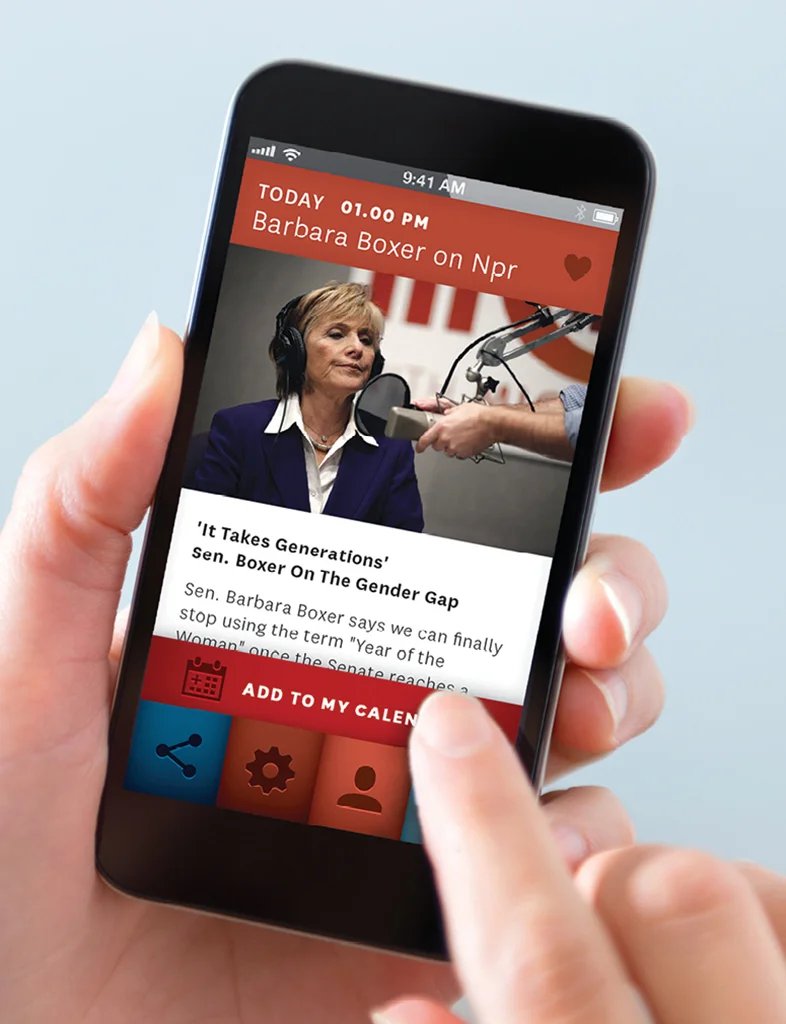
XX is a cause-related marketing brand that will enable women to shift the focus of their power from purses to polls. XX offers tools to stay on top of political events and a community of political participation and activity. By collaborating with brands XX will provide women a chance to invest in products and services that participate in changing the history.
With the support of the amazing thesis advisors Michele Ronsen and Carolina de Bartolo I built the concept for a co-branding opportunity and organization that helps politically like-minded companies allocate parts of their revenue to women's political education.
Agency: Salt Branding
Client: Sling Media
Role in the project: Packaging, Concepts
The Slingbox is a TV streaming media device made by Sling Media. It allows users to remotely view and control their cable, satellite, or DVR system at home from a remote Internet-connected PC, smartphone or tablet as if they were at home.
With Creative Director and Design Principal Cesar Chin, I created concepts to support the new product identity and packaging of Slingbox streaming device.